Brand Identity — Aprilmae
Barely there, entirely considered.
Aprilmae is underwear that gets out of the way — and looks good doing it.
We approached the identity the same way the product is made — by removing everything unnecessary. The brief wasn't to make something pretty. It was to make something that disappears into a wardrobe and a lifestyle, effortlessly.
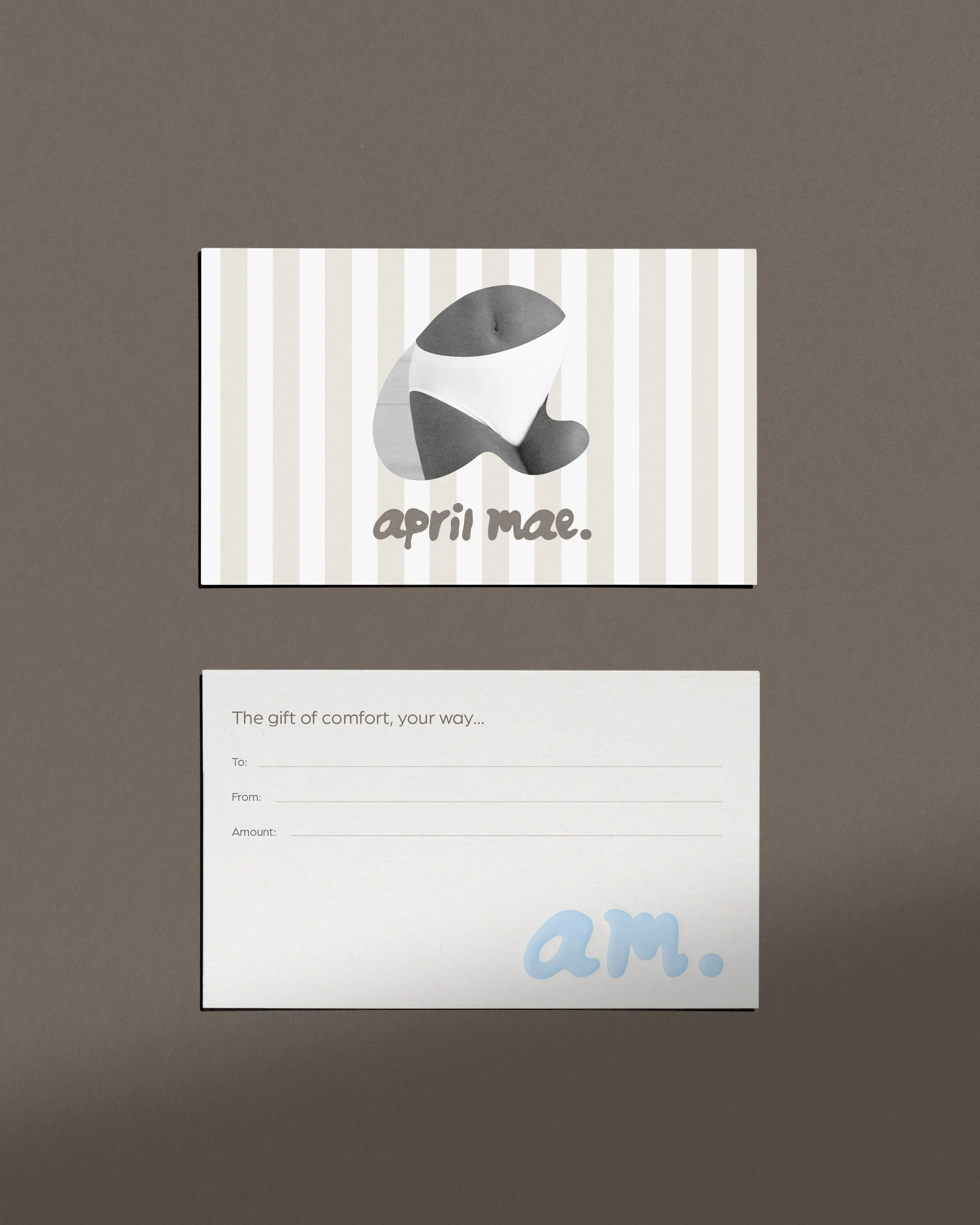
The logo is minimal by intention. No flourish, no weight it doesn't need. Designed to sit on a label, a bag, a box — and feel like it belongs on all three. The brand palette follows the same logic: soft, skin-adjacent tones that feel intimate without being precious.
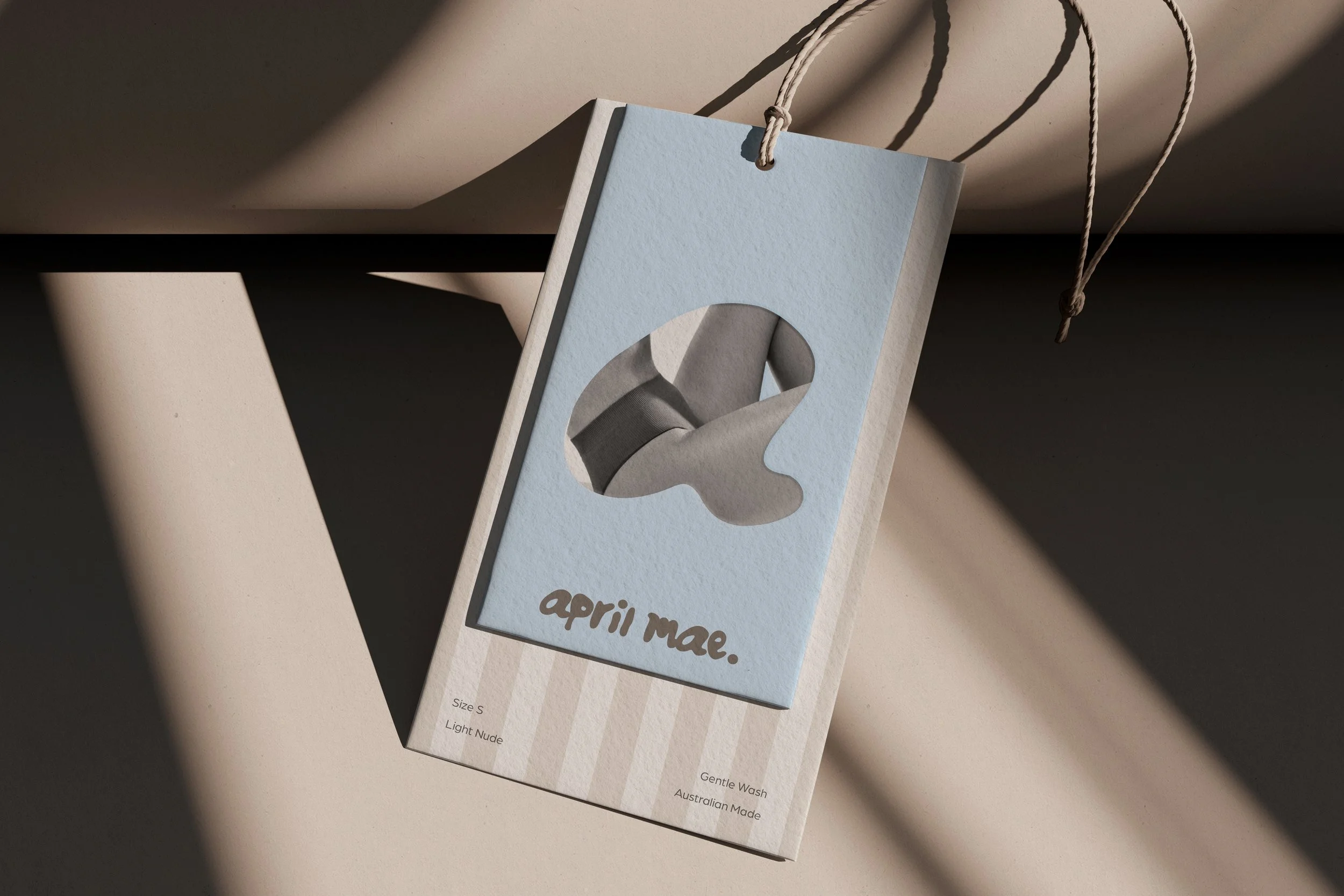
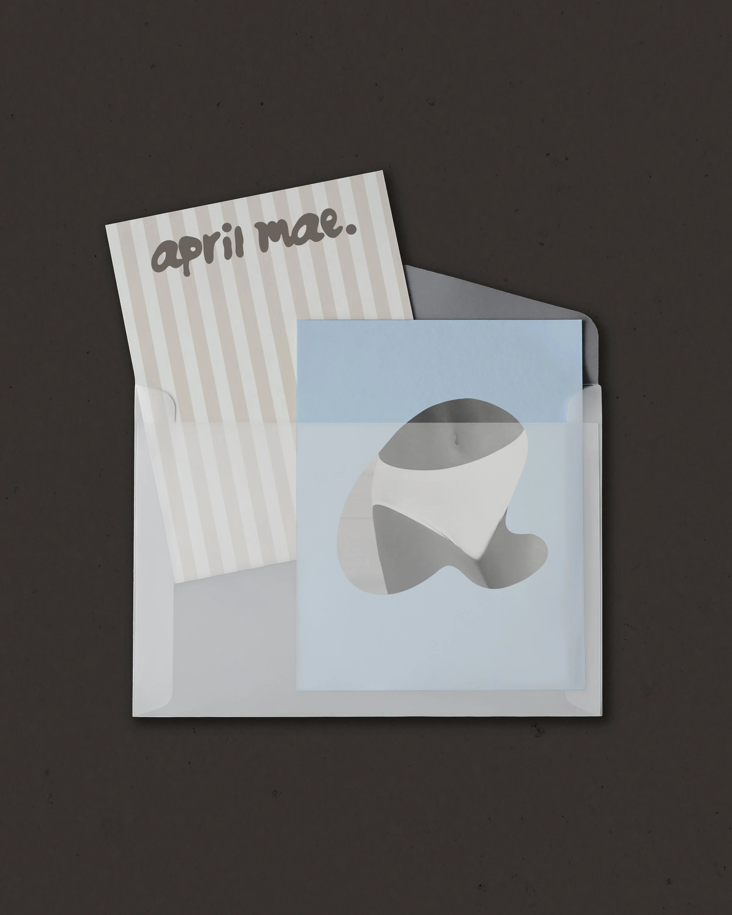
Packaging was considered as a moment of touch. The kind of unboxing that doesn't perform — it just feels right. Every detail scaled back to only what earns its place.
The result is a brand as seamless as what's inside it.
Brand Strategy
Aprilmae sits closer to a cult lifestyle label than an intimates brand. The strategy leaned into softness as a point of difference — approachable, personal, quietly playful. A brand that feels like it was made by someone who actually wears it.
Logo Design
Handwritten and deliberately imperfect, the logo was drawn from the way honey moves — slow, fluid, tactile. In a category full of clean sans-serifs signalling luxury, april mae. does the opposite. It signals personality. The full stop at the end says everything: final, unhurried, sure of itself.
Packaging Design
Powder blue over a warm stripe base, uncoated stock, natural twine. Unexpected for intimates — and that's the point. The kind of tag you don't throw away.
Identity Design
The die-cut shape carries the same logic as the logo — organic, pooling, unresolved at the edges. It echoes the honey reference without stating it, and lets the product show through. Every element of the identity follows that same instinct: nothing overworked, nothing accidental.