Brand Identity - Sunbase
Sun care, reimagined.
Where SPF meets the lifestyle it always deserved — warm, considered, and effortlessly at home in modern living.
Sunbase came to us with an image problem — not theirs, but the category's. SPF has always felt clinical, obligatory, forgettable. They wanted out of that world entirely.
We built the brand from a different reference point. Not other suncare labels, but the objects people keep out because they're worth looking at. From that, everything followed — soft tones, restrained typography, a minimal identity that feels warm without trying too hard.
Packaging designed to live on the shelf, not hide under it. A logo quiet enough to go anywhere. A brand that doesn't ask you to think about sunscreen — it just fits into how you already live.
Brand Strategy
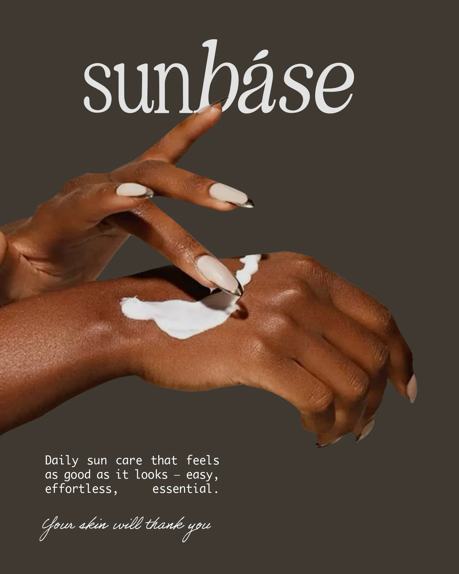
Positioning Sunbase within the lifestyle and wellness space — moving sun care out of the pharmacy aisle and into the everyday ritual.
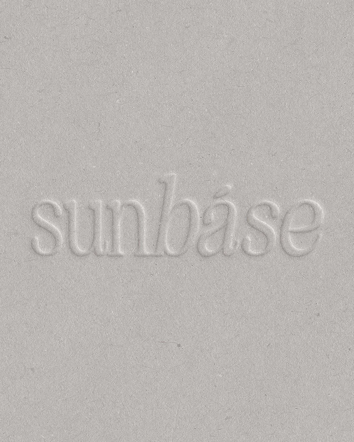
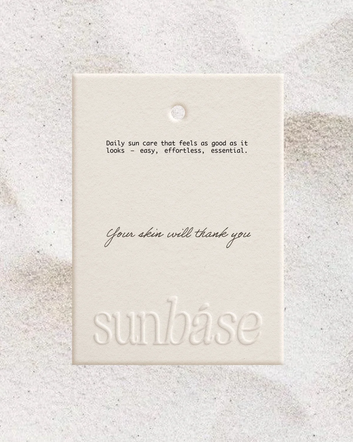
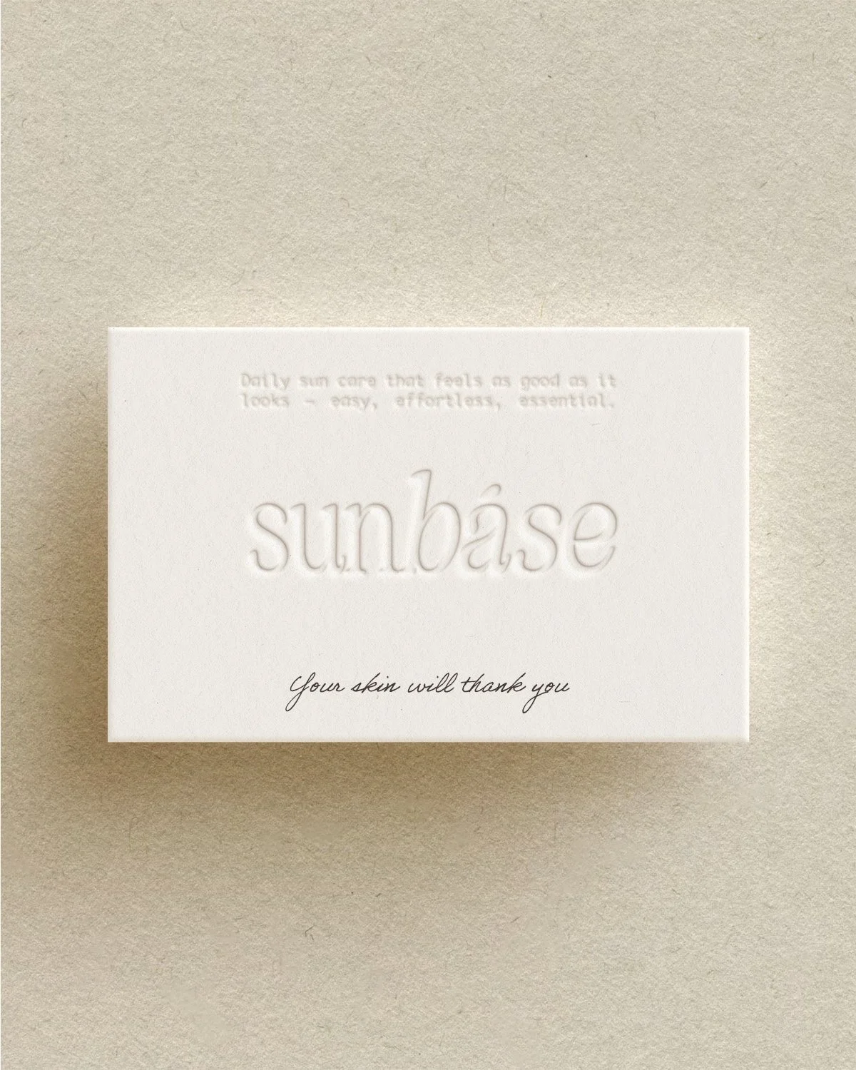
Logo Design
A mark that is quietly confident — designed to sit as naturally on a bathroom shelf as it does on a feed.
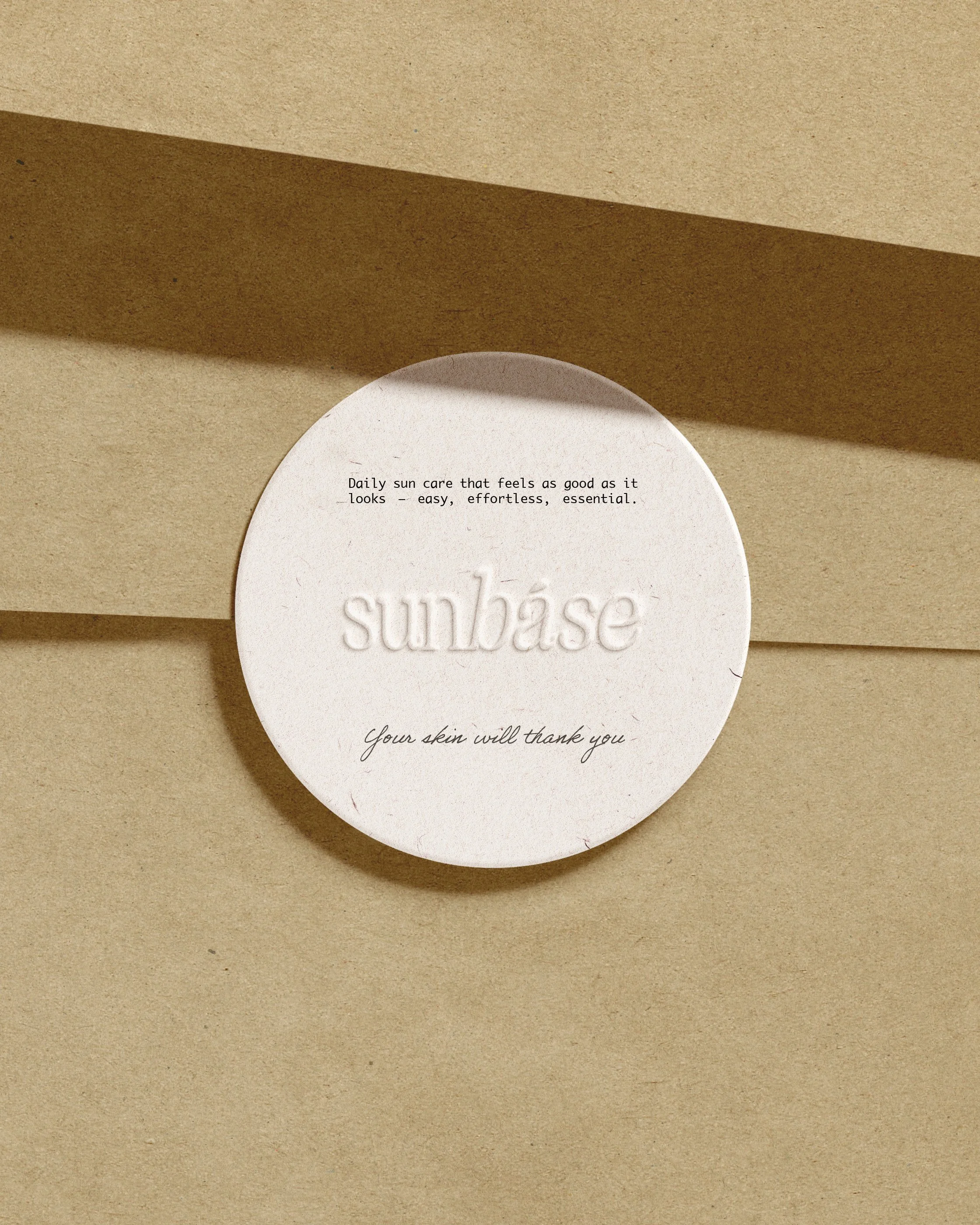
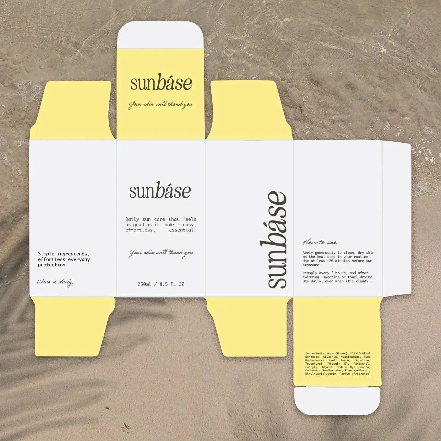
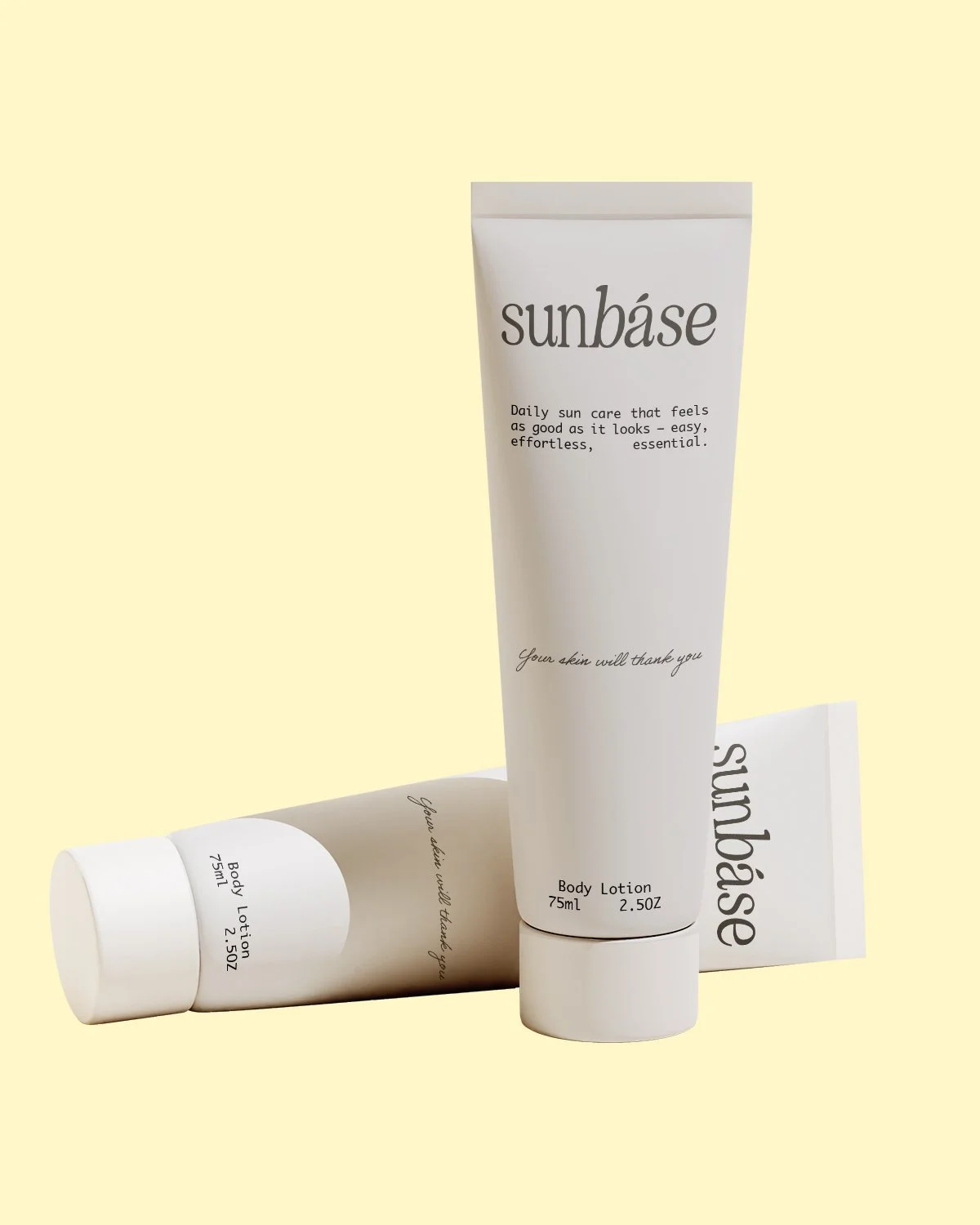
Packaging Design
Tactile, considered, and made to be left out. Packaging that feels like part of the home rather than something to hide away.
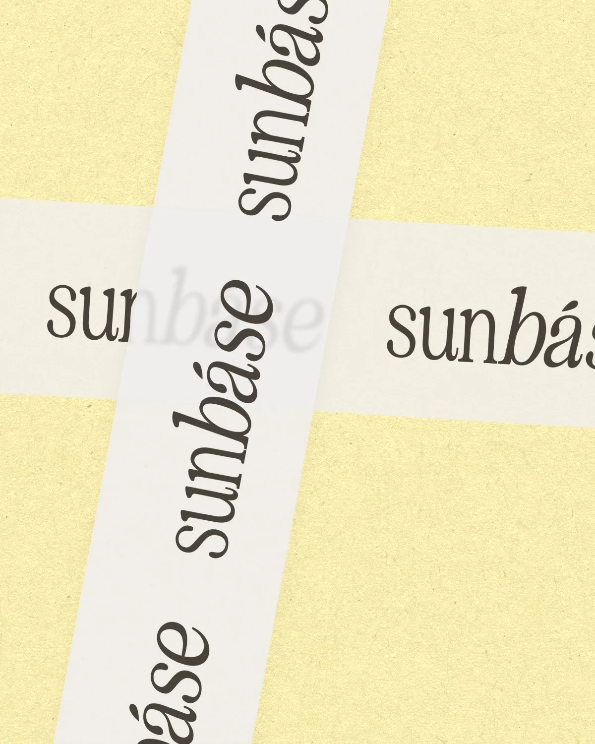
Identity Design
A clean, contemporary visual language built on soft tones and minimal form — warm without being precious, refined without being cold.