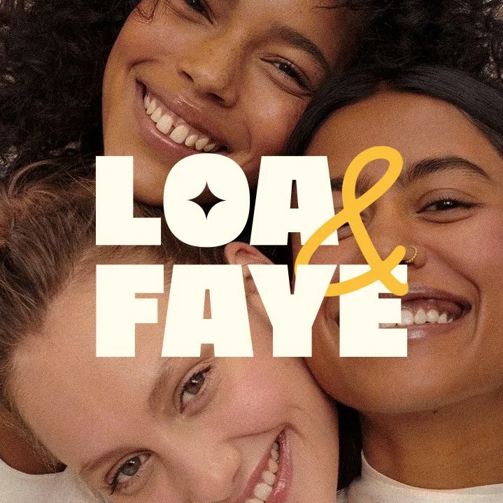
Shaping a Modern Skincare Brand
Loa & Faye Brand Identity and Package Design
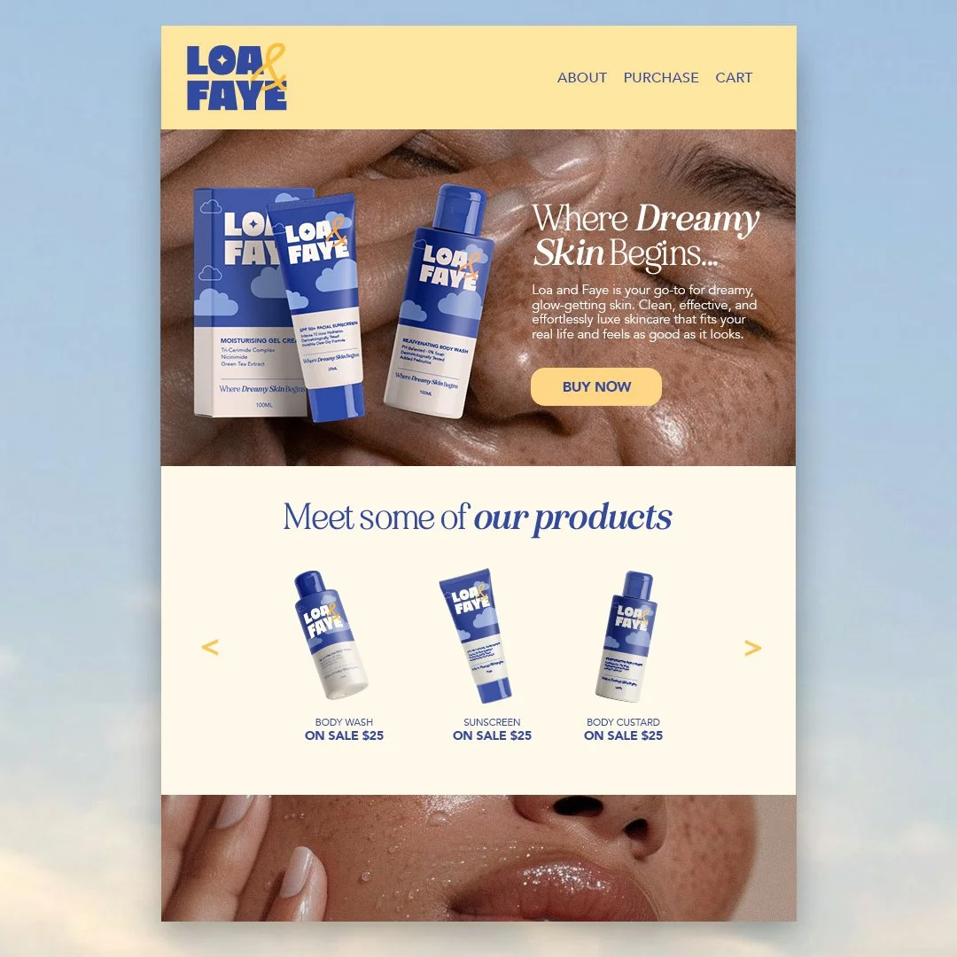
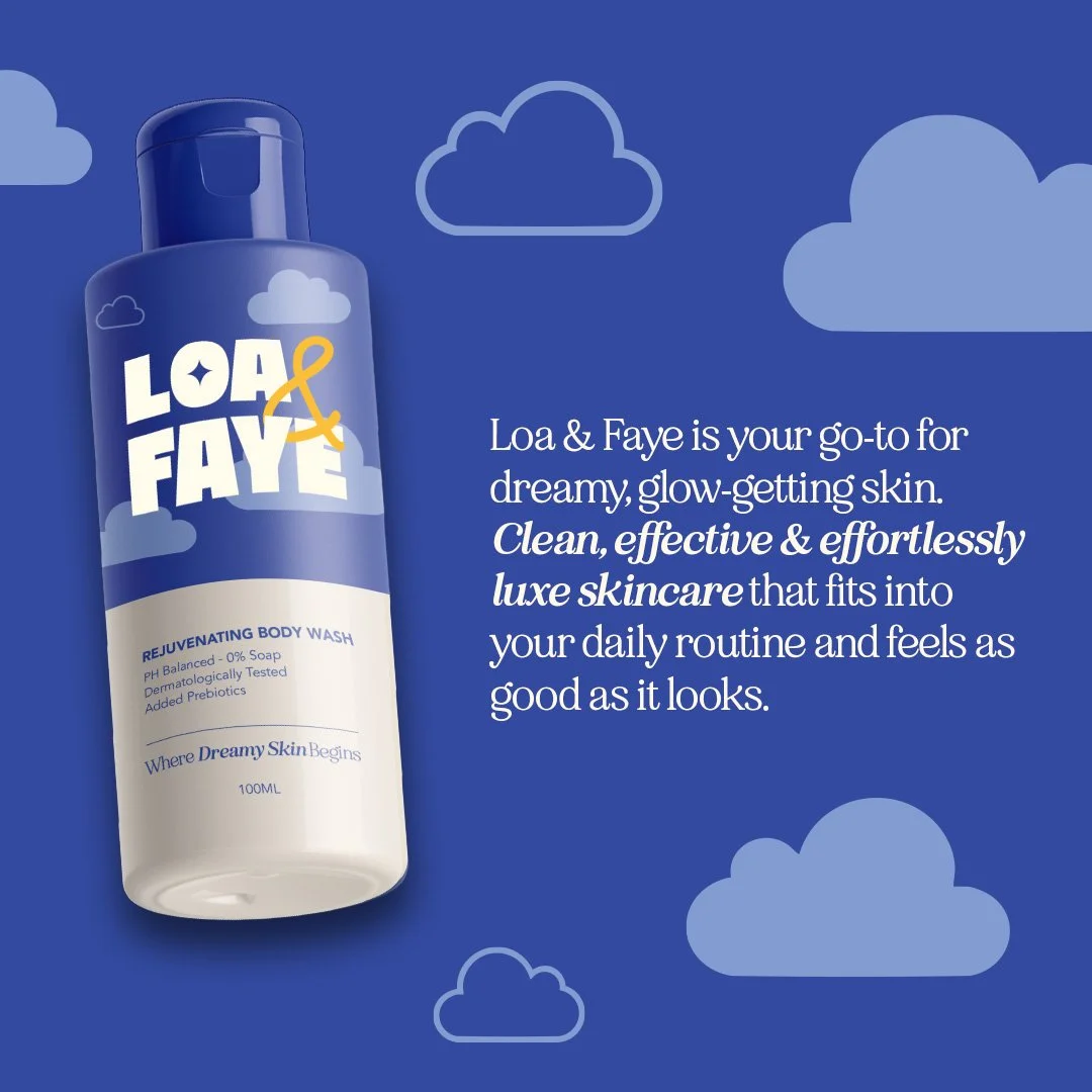
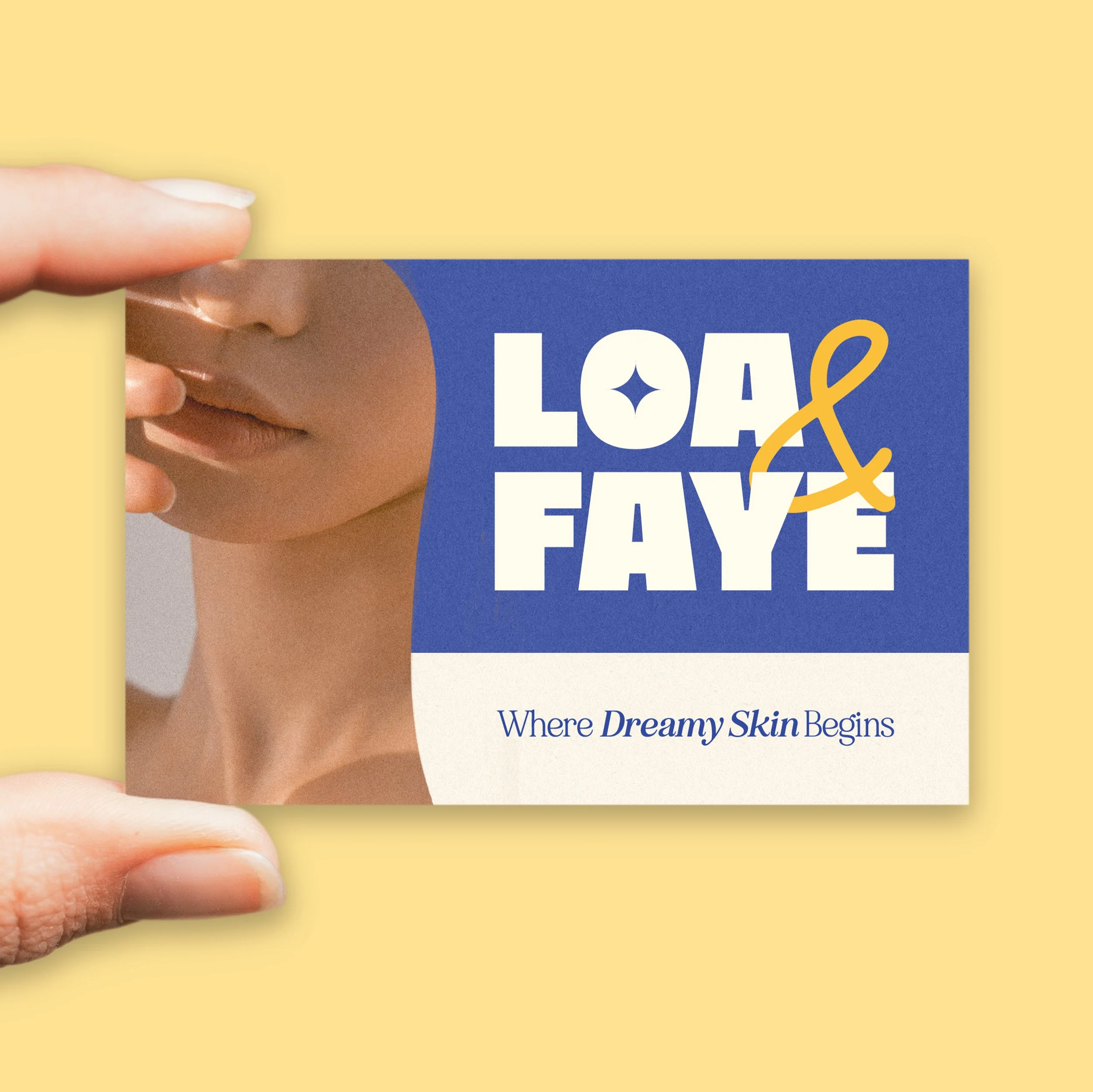
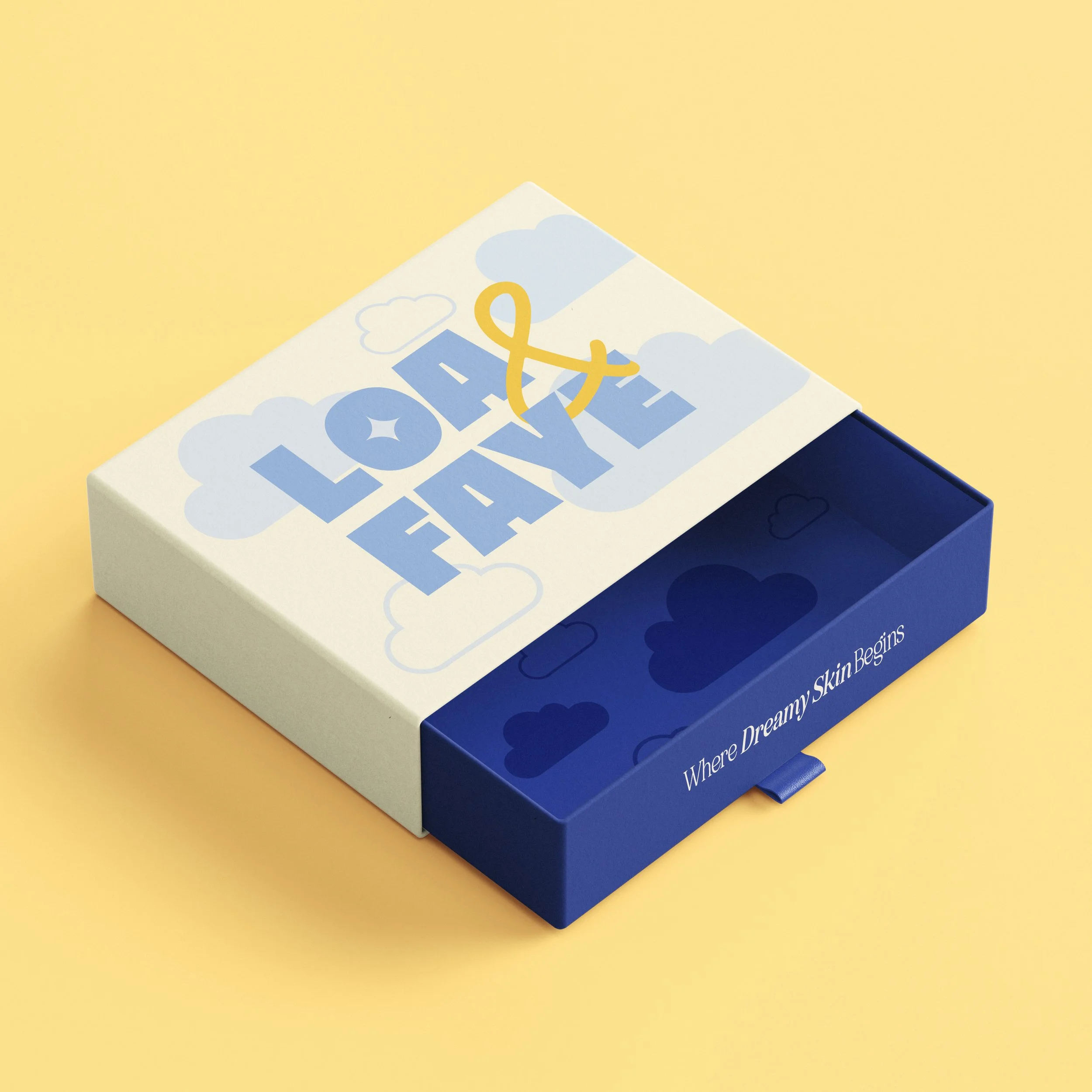
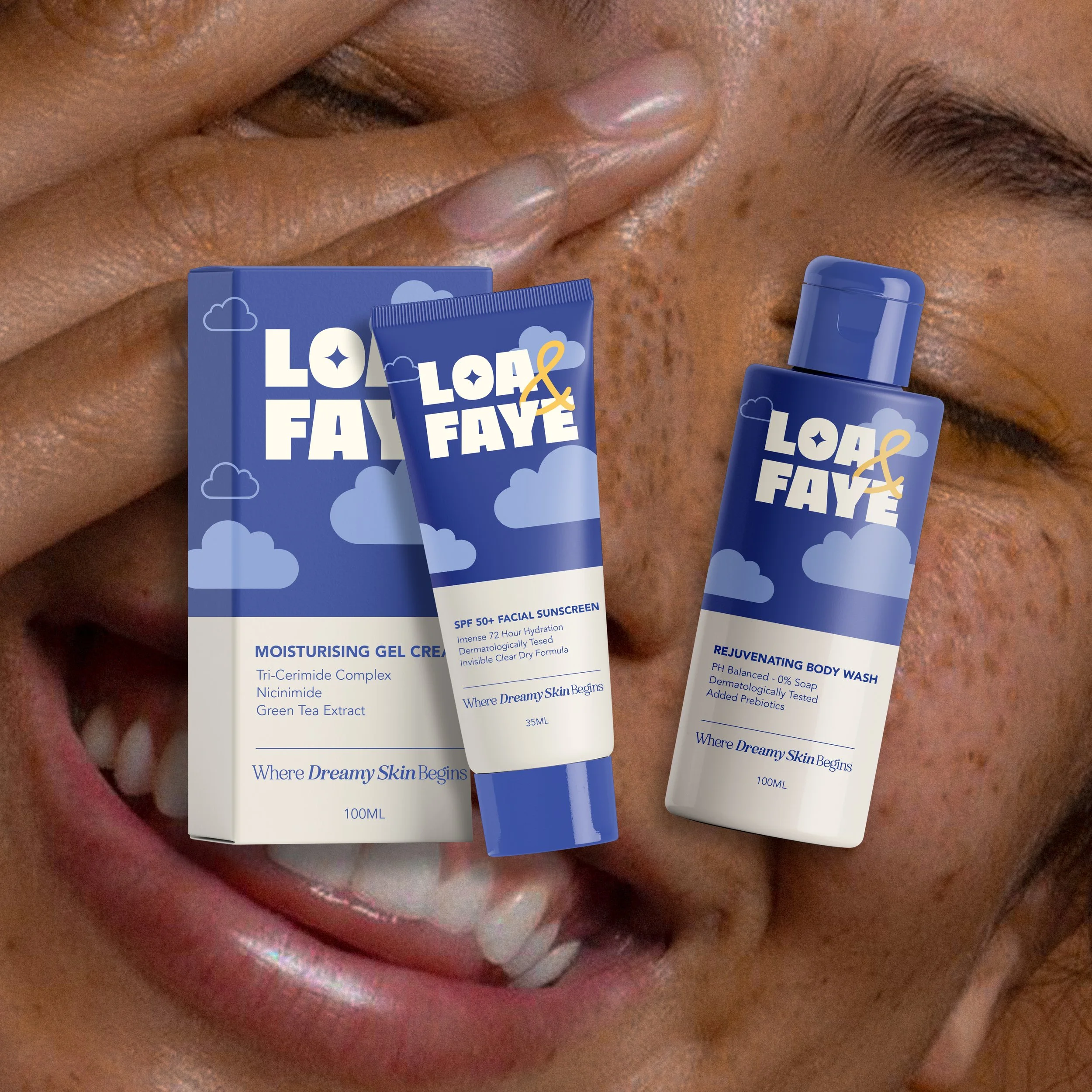
Loa & Faye was designed to capture the feeling of dreamy yet grounded skincare, creating a brand that feels calm, modern and approachable. The typography balances structure with softness, pairing a bold slab serif logo with a handwritten script, supported by elegant serif headings and a clean sans serif body type for clarity and ease.
Soft hues of blue form a calming foundation for the colour palette, complemented by a warm orange accent that adds subtle energy. A cloud-inspired pattern reinforces the dreamscape concept, adding lightness and texture across packaging and brand touchpoints.
The outcome is a cohesive brand identity applied across packaging, website, social media and marketing assets, creating a flexible system that feels fresh, inviting and memorable while supporting the brand as it grows.
What we used
Brand design/ strategy
Package design
Social Media Kit
Brand Guidelines
Logo Design
Collateral Design